Two-Tone or Single-Tone Personalized Jewelry: Compare the Contrast
Compare two-tone contrast with a more unified tone impression by observing the recipient's current jewelry, wardrobe, and preference for a focal accent.
Two tone vs single tone personalized jewelry is a question of visual contrast, not a ranking of metal quality. A two-tone design uses a contrasting area to direct attention, while a more unified impression lets shape, engraving, and accents carry the detail. Observe what the recipient repeatedly wears, then compare the current product images and exact finish labels.
Define contrast at ordinary viewing distance
Zoomed product images can make a small contrasting area dominate the screen. View the complete piece at everyday scale and ask where the eye lands first. Does the recipient enjoy a visible focal point, or do their usual pieces read as one continuous tone?
Contrast can come from finish, crystal treatment, engraving, or colored month accents. Identify which contrast the product actually offers rather than using “two-tone” as a broad material claim.
Study the recipient’s existing combinations
Look at necklaces worn often, not only special-occasion jewelry. Note whether the person combines warm and cool finishes, wears contrasting pendants on simple chains, or keeps a unified color across chain and focal area.
Compare wardrobe hardware, watch details, and the jewelry worn in the same outfit. Avoid rules based on age or complexion. Repeated personal choices provide better evidence than a general style formula.
Count how often contrast appears. One mixed-finish heirloom does not establish an everyday preference if every frequently worn necklace is visually unified. Conversely, a watch, rings, and earrings that combine tones repeatedly provide stronger evidence that a contrasting pendant will feel familiar.
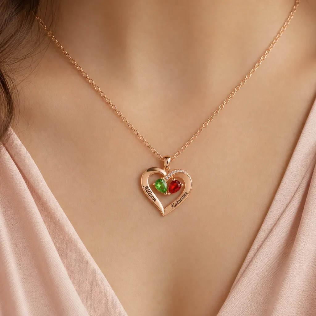
Read the teardrop necklace as a contrast design
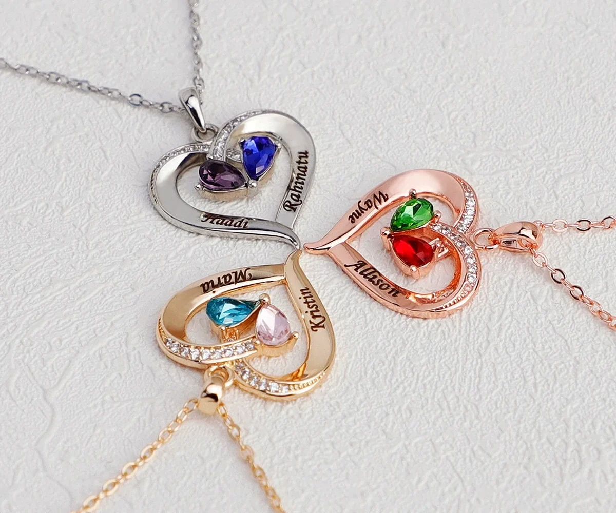
The Two-Tone Teardrop Story Necklace is designed for exactly two loved ones through two engraved names and two simulated birthstone selections. Its current product presentation includes three finish-tone options and a choice between a crystal-set or smooth engraved heart accent.
The heart area creates a focal decision inside the teardrop structure. Compare the current official images for each tone and heart treatment. Do not assume that a tone label identifies a different precious-metal standard; follow the plated copper-base and stainless-steel-component wording on the product page.
Choose this design only if its fixed two-person structure fits. A preferred contrast cannot add a third name or month.
Compare against a more unified impression
Use the Amorieva collection to identify a current design whose main outline reads more continuously, such as connected engraved bands or a single-tone heart composition. Compare silhouette, family count, and format before comparing color.
Place screenshots side by side on the same device without filters. Write one sentence for each: “The focal heart leads,” or “The connected outline leads.” This keeps the contrast choice tied to visible structure rather than an imagined quality difference.
Hide the product names and ask a trusted observer which image resembles the recipient’s current collection. Then reveal the fields and verify that the selected design supports the correct people. A blind visual comparison can reduce brand-name or product-title bias, but capacity remains a required gate.
Make a contrast scorecard
- Recipient mixes finish tones regularly.
- A focal accent appears in their everyday jewelry.
- The two-person layout matches the intended story.
- The available tone label coordinates with existing pieces.
- The crystal-set or smooth heart preference is known.
- Current plated-jewelry care fits the recipient’s routine.
Use the Amorieva care guide for every finish option. Contrast does not establish different resistance to water, chemicals, or daily rubbing. Ask the materials FAQ when wording remains unclear.
Review the smooth and crystal-set heart options independently. The heart treatment changes texture and sparkle, while the broader two-tone impression comes from the product’s complete presentation. Do not use one label to answer both style questions.
If the recipient’s collection is mixed and no preference emerges, invite them to select the finish while keeping names and months private. A partial reveal protects the personalized surprise and prevents a tone guess from controlling the gift.
Common questions
Is two-tone jewelry made from two precious metals?
The visual term alone does not establish composition. Read the current materials description for the documented base components and plated finish.
Does a smooth heart make the necklace single-tone?
It changes the heart treatment, but the complete visual presentation depends on the selected current tone and product structure. Review the official option image for that configuration.
Can screen color determine the exact match?
No exact digital match should be assumed. Use the official tone labels, compare relative contrast on one device, and expect photography and displays to affect appearance.
Choose the amount of contrast the recipient already enjoys
A two-tone focal point can make a compact design feel more layered; a unified impression can keep attention on silhouette and names. Neither is inherently better. Let established wearing habits, the fixed two-person story, and current product options determine which visual rhythm belongs in the recipient’s collection.
Before submitting, describe the selected appearance without metal assumptions: product, finish-tone label, smooth or crystal-set heart, and the two name-and-month pairs. If that sentence is clear and matches the current page, contrast is serving a documented choice rather than an imagined specification.
Save the sentence with the order so a later comparison uses the same visual terms the buyer approved.