How to Match a Personalized Jewelry Tone to Pieces She Already Wears
Match a personalized jewelry tone by observing the recipient's repeated choices, comparing pieces in neutral light, and keeping tone labels distinct from materials.
To match a personalized jewelry tone to existing pieces, look for repeated behavior rather than a single photograph. Gather two or three items the recipient wears often, view them in neutral daylight, and note whether warm gold, pink-toned, or cooler stainless-steel-colored finishes dominate. Then compare those observations with the exact tone labels on the product page without assuming the color identifies a precious-metal composition.
Use frequency as the strongest evidence
A piece worn weekly tells you more than one borrowed for an event. Check everyday necklaces, bracelets, rings, watch hardware, and bag details. Record what appears repeatedly and what is reserved for special outfits.
Also notice mixing. Some people combine warm and cool finishes comfortably; others keep one dominant family. If the collection is genuinely mixed, coordinate with the format worn nearest the new piece. A cuff may be compared with a watch or bracelet stack, while a necklace should be compared with usual pendants.
Create a neutral-light comparison
Indoor bulbs can make finishes appear warmer or cooler. Photograph the existing pieces together near a window in indirect daylight, without filters, and include a neutral white or gray object for context. Do not treat the photo as a color standard; use it to compare relative warmth within one scene.
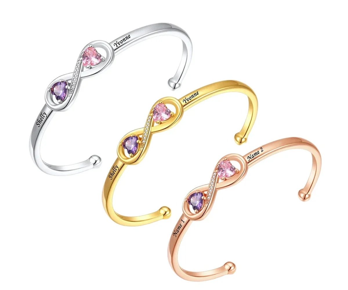
Then view the current product images on the same device. Screens and product lighting still vary, so match the named tone and general family rather than expecting an exact digital swatch. The Amorieva collection uses labels such as Gold Tone, Rose Gold Tone, and Stainless Steel Tone on products that offer those options.
Repeat the comparison beside the clothing the recipient most often wears with jewelry. A finish may look dominant in a jewelry box but function differently beside a work uniform, favorite knitwear, or watch. The question is not which tone wins alone; it is which one joins an existing routine.
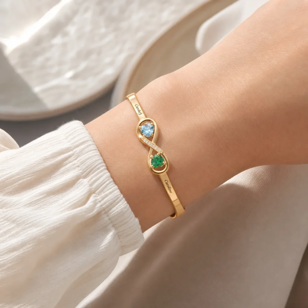
Apply the method to a two-person cuff
The Open Heart Birthstone Cuff currently offers those three tone choices on a plated copper-base design. It is personalized for exactly two loved ones with two engraved names and two simulated birthstones.
Select tone only after confirming that the wearer likes open cuffs and that the two-person structure fits the story. A familiar color cannot solve an uncertain wrist format. Compare the cuff’s listed dimensions and a bracelet she already wears before treating it as a suitable surprise.
Keep finish language precise in your planning notes. “Gold Tone” describes the selected appearance label; it should not be rewritten as a different metal specification. The current product page controls both available tone and materials wording.
Bring wardrobe context into the choice
Consider the colors and necklines or sleeves worn with everyday jewelry. A tone that appears across both accessories and clothing hardware may integrate easily. However, do not create rules based on complexion, age, or what someone “should” wear. Personal repetition and stated preference are better evidence.
If the gift giver cannot identify a clear pattern, ask a low-pressure question or let the recipient choose the tone while keeping engraving private. Uncertainty is a reason to share one decision, not to invent a universal style formula.
A controlled question can preserve most of the surprise: show three unlabeled tone families on unrelated accessories and ask which they would combine with their current jewelry. Record the answer using the actual product label only after returning to the live page.
Do not compare a heavily worn older piece as though its current surface were the original catalog tone. Use several current items and focus on the recipient’s repeated warm, pink-toned, or cool preference. When every reference differs, mark tone as unresolved and share that choice instead of averaging colors in your head.
Review tone with care expectations
All three options are plated finishes and need the same conservative care baseline: keep the piece dry, remove it before showering, swimming, exercise, saltwater, and chlorinated water, avoid perfume and household chemicals, wipe gently, and store separately.
A darker or lighter tone does not make normal surface change invisible. Use the Amorieva care guide and the materials FAQ rather than choosing a finish based on an unsupported durability assumption.
Common questions
Should all of her jewelry have the same tone?
No. Many people mix finishes. Look at the pieces she combines in the same outfit and decide whether the new item should blend with the dominant group or join an intentional mix.
Can I identify the metal from the color?
Color alone is not a material specification. Use the tone label for appearance and read the current product description for the documented base construction and plated finish.
What if product photos look different on two screens?
That is possible because displays and image conditions vary. Compare the official tone labels and overall warm, pink-toned, or cool appearance rather than demanding an exact screen match.
Match habits, not a theory
The most reliable tone choice grows from what the recipient already reaches for. Observe repeated pieces, compare them in consistent light, confirm the product label, and keep material claims separate. That method respects her style without turning complexion or fashion rules into a guess about personal preference.