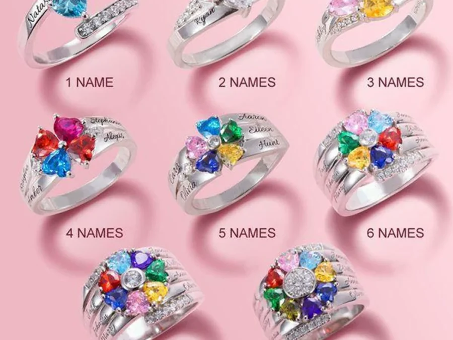
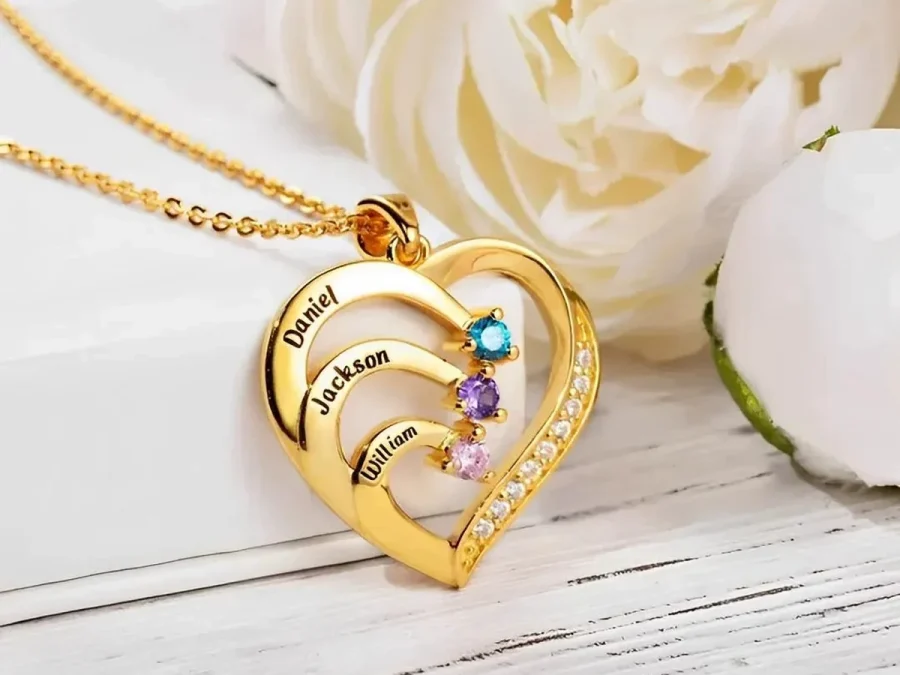
How Birthstone Colors Work With Different Metal Tones
Coordinate birthstone colors with gold, rose-gold, or stainless-steel tones by starting with accurate months, then judging contrast and overall warmth.
Birthstone colors work with metal tones through contrast, warmth, and the way several small accents read as one group. Confirm the correct birth month for every person first. Then compare gold, rose-gold, and stainless-steel-tone options against the complete palette and the recipient’s existing jewelry. There is no universal pairing rule: the most useful choice is the one that keeps the family information accurate and fits what she already wears.
Separate family meaning from color styling
A birthstone selection represents a month, while a metal tone is an appearance choice for the surrounding design. These two decisions should not be given equal authority. If a child was born in July, choose July from the product selector; do not switch the month because another red, blue, or green seems easier to coordinate.
Start with a written name-and-month list. The customary associations in Amorieva’s birthstones by month guide can help you check the labels, while the current product selector shows the options actually available for the piece. Traditions may have alternatives, but the jewelry form should be completed using its defined month choices.
Once the family facts are fixed, the tone can organize their colors visually. Think of it as the frame around a photograph: it changes the overall impression without changing who belongs in the picture.
Notice warmth and contrast without turning them into rules
Gold tone often creates a warmer-looking frame. Rose-gold tone adds a pink or copper-like cast. Stainless-steel tone tends to read cooler and more neutral. These are visual descriptions, not claims that the piece is made from the precious metal suggested by the color name.
A warm frame may make red, amber, or pink accents feel more continuous, while a cooler frame may make those colors stand out more sharply. Blue or green accents can appear crisp against a cooler tone and more contrasted against a warmer one. Actual perception depends on lighting, image processing, the surrounding design, and the viewer, so treat these as comparison prompts rather than guaranteed effects.
The recipient’s wardrobe is a useful reference. If she consistently chooses one tone in earrings, bags, or watch hardware, familiarity may matter more than a theoretical color pairing. If she mixes tones freely, the complete family palette can lead.
Judge one accent differently from a family group
With one birthstone color, the decision is a simple relationship between accent and frame. With several family months, neighboring colors also affect one another. Two bright accents can become focal points; repeated months can create rhythm; a single contrasting color can draw the eye even when every person has equal meaning.
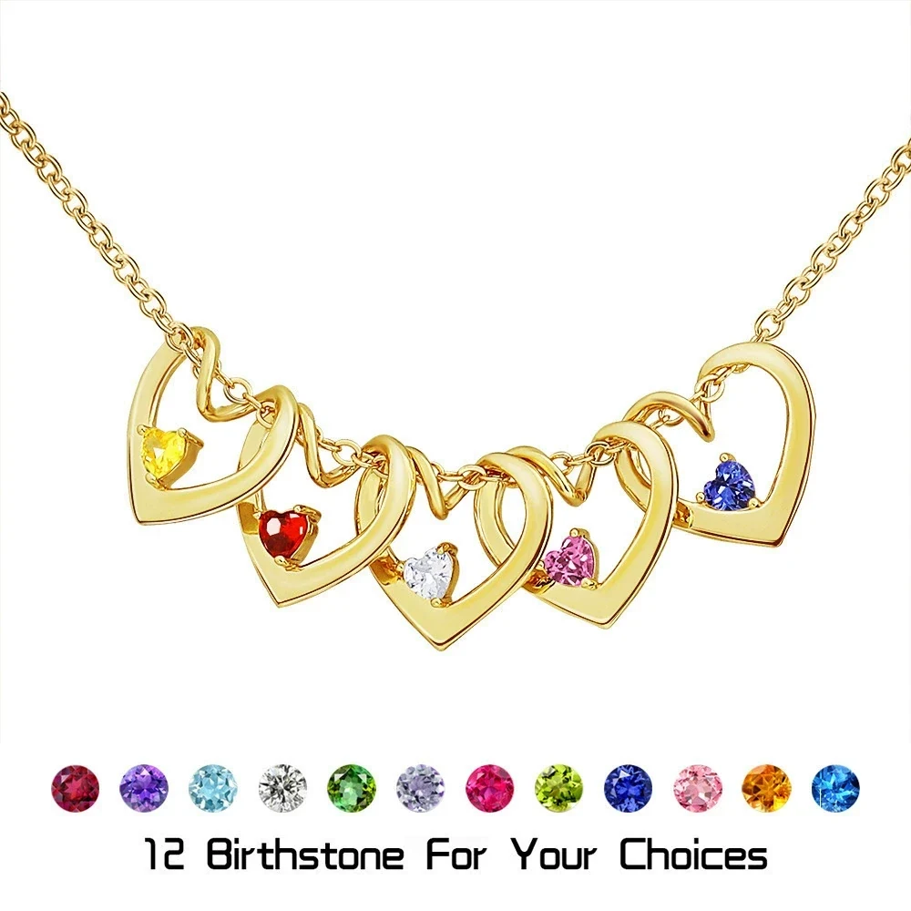
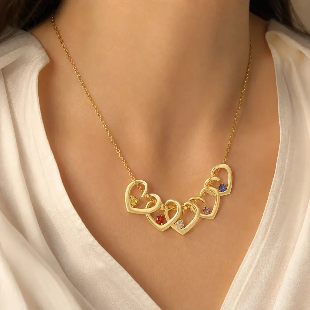
The current Twisted Heart Birthstone Necklace supports one to five loved ones, each with a name and simulated birthstone selection. It is available in necklace or bracelet format and in gold, stainless-steel, or rose-gold tones. To compare it thoughtfully, write all one-to-five month choices in order and evaluate them as a set rather than choosing a tone after looking at only the first color.
Equal family meaning does not require equal visual intensity. Some month colors naturally appear lighter or darker in a given image. Names and positions are what keep the representation explicit. Do not reorder people solely to scatter similar colors unless that order also makes sense to the family.
Compare the choices at realistic scale
A color selector or enlarged guide image helps identify the choices, but it is not a life-size preview. Small simulated birthstone accents may read more subtly when worn than they do in a close-up. Look at both the option guide and a model-scale product image, and allow for differences between screens.
Use this sequence:
- Confirm every name and actual birth month.
- Place the people in a meaningful order.
- Look at the full set of month colors together.
- Compare the three offered tones with jewelry she already wears.
- Recheck the month labels instead of choosing by sampled screen color.
If the combined palette feels too colorful for her style, consider a name-led design in the current collection. Do not remove or change a person’s month simply to quiet the palette.
Common questions
Does stainless-steel tone only work with cool birthstone colors?
No. A cooler-looking frame can also create useful contrast with warm colors. The recipient’s existing jewelry, the complete group of month accents, and the desired level of contrast are better guides than a rigid warm-versus-cool rule.
Should matching birth months be separated in the layout?
Only if the chosen family order supports it. Repeated months are accurate, and their matching accents can form a deliberate visual rhythm. Keep names and positions clear rather than rearranging people solely for color variety.
Will the colors match the online guide exactly?
An exact screen match should not be assumed. Lighting, photography, display settings, and the small size of an accent can alter its appearance. Select the verified month label and use images for general comparison.
Choose one method and keep the facts intact
Build the family palette from real months, then let the recipient’s habits decide how it is framed. Compare warmth, contrast, and the complete color group at a realistic scale. After the tone is selected, protect the plated piece from moisture, perfume, and household chemicals using Amorieva’s care guidance. A coherent result comes from consistent decisions—not from changing family facts to satisfy a color rule.