How Birthstone Color Contrast Works in Small Jewelry Accents
Learn how neighboring colors, repeated months, and accent scale affect birthstone contrast, then plan a readable name-and-month family layout.
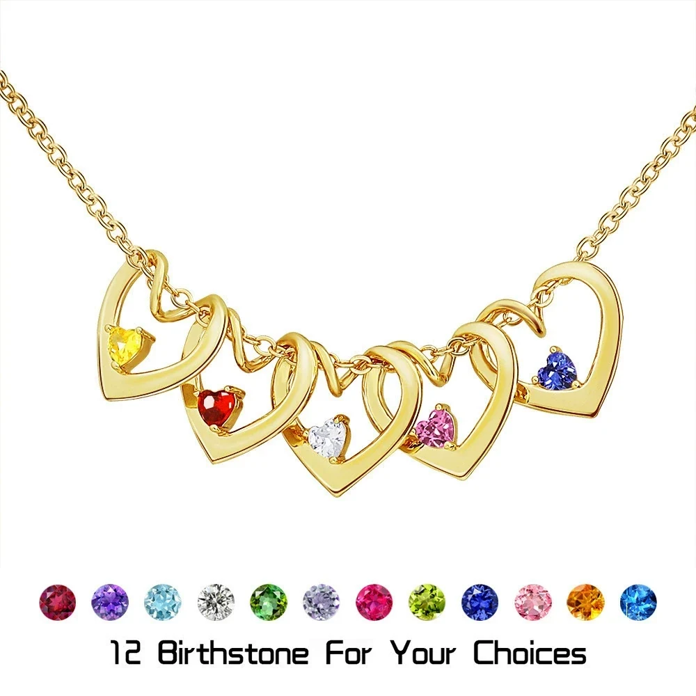
Birthstone color contrast in small jewelry depends on relationships between accents, not just the color of each one alone. Two blues beside each other may blend more than a blue beside a red; two pale colors may share similar brightness even when their hues differ. Because the accents are small, names, position, and verified month labels should remain the main identification system.
Contrast is created between neighboring accents
A color that looks distinct on a twelve-month chart may appear less separate when placed directly beside a similar color. The eye compares adjacent accents first. Differences in hue, lightness, and intensity can help, but small scale compresses those differences.
Imagine three sequences: pale blue beside deep blue, pale blue beside pale green, and pale blue repeated twice. The first may separate through light and dark. The second may separate mainly through hue. The repeated pair intentionally has no color distinction, so its names and positions must explain that two people share the same month.
Birthstone traditions and alternatives vary by place and era, and product charts simplify those traditions into selectable month colors. The family birthstone month guide can help confirm the customary labels, but it is not a promise that every small accent will remain visually distinct from every neighbor.
Accent scale changes what the eye can resolve
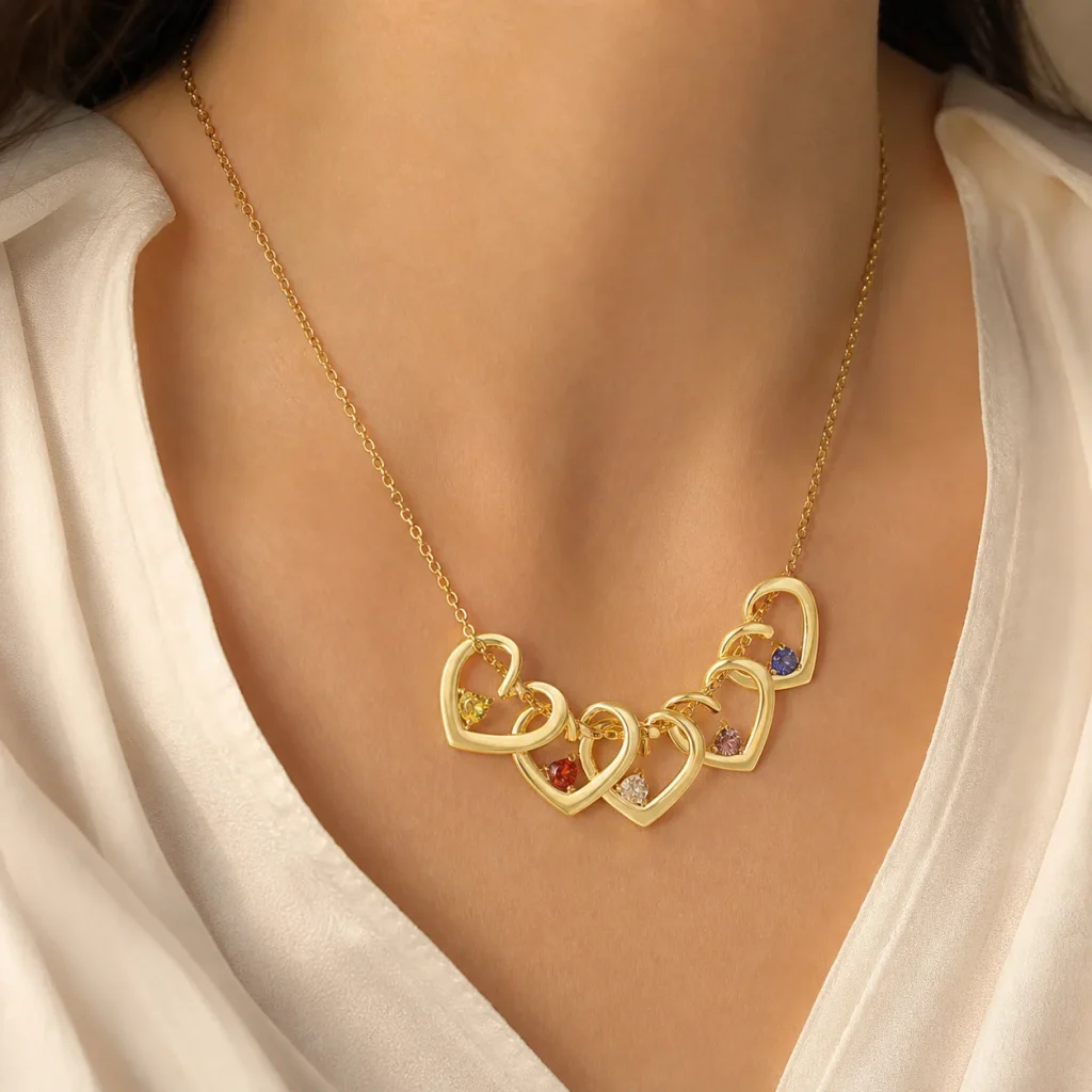
On a large screen, a swatch occupies enough area to show subtle undertones. On a wearable piece, an accent may be only one detail among engraving, metal curves, reflections, and movement. The smaller the color area, the more likely nearby surfaces will influence the overall impression.
This does not make the personalization unsuccessful. It changes the job of color. A small accent can add rhythm and month symbolism without functioning as a standalone label. The engraved name and its location provide information that remains meaningful when two colors are close.
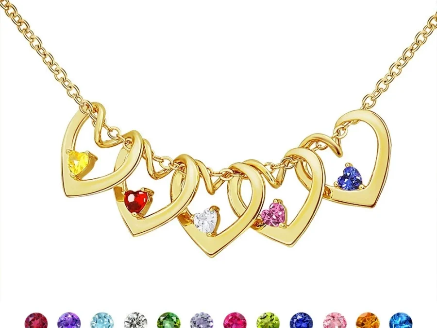
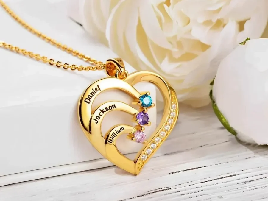
The Twisted Heart Birthstone Necklace supports one to five loved ones through engraved names and January-through-December selections. Its colored details are simulated birthstone accents. Read each name-and-month pair as a unit rather than expecting the accent to identify a person from across a room.
Plan repeated and similar months deliberately
Make a row for every position before ordering. Mark exact name, confirmed month, and a broad color family such as red, light blue, deep blue, green, or clear. The broad color note is only for layout awareness; the month label remains the actual selection.
Then review adjacent pairs:
- Different hue and lightness: likely to create the strongest visual break.
- Similar hue, different lightness: may separate in good light but converge in shadow.
- Different hue, similar lightness: can read as distinct up close while sharing overall softness.
- Repeated month: creates intentional rhythm and needs clear name placement.
Do not reorder relatives only to maximize contrast if sequence carries family meaning. Birth order, a couple-first layout, or another agreed rule may matter more than color variety. If order is flexible, you can test two sequences on paper and choose the one that gives neighboring accents more separation without implying rank.
Keep both sketches when several people are contributing to the gift. Label the preferred version and write the reason—family order or visual separation—beside it. This prevents a later editor from “correcting” an intentional repeated or low-contrast pair.
Use engraving and structure as the accessibility layer
Color perception varies, and some recipients may not distinguish certain hues reliably. A personalized design should not make color the only way to tell people apart. Use clear names, a documented order, and a consistent mapping from the first field to the first accent.
Review the completed fields through the Amorieva personalization process: read Name 1 and Month 1 together, then continue position by position. If a recipient cares more about readable names than color, compare name-led pieces in the current collection rather than forcing a birthstone layout.
A gift message can also explain repetition: “The matching blue accents show that both children were born in the same month.” That adds useful context without pretending the colors are more distinguishable than they are.
Common questions
Should I separate two similar months in the layout?
You can when the family order is flexible, but do not sacrifice a meaningful sequence merely for color spacing. Names and positions can distinguish adjacent accents that share a color family.
What if two people share the same birth month?
Select the same verified month for both. Repetition is accurate and can create a deliberate visual rhythm. Keep each person’s engraving attached to the correct position.
Can I judge contrast from the largest product image?
Use it as an approximate composition reference, not a guarantee. A close-up enlarges small accents, while the worn piece includes reflections, movement, and viewing distance. Prioritize labels and names.
Design for meaning at actual scale
Strong color contrast can make a family layout lively, but it should not carry the burden of identification. Plan neighboring colors, recognize intentional repetition, and preserve any meaningful name order. When the wearer can read the family story through engraving and position, small simulated birthstone accents are free to do what they do best: add a compact visual pattern of shared months.