What Gold Tone, Rose Gold Tone, and Stainless Steel Tone Mean
Learn what three jewelry tone labels describe, what they do not prove about metal content, and how to choose an appearance for a personalized piece.
Gold Tone, Rose Gold Tone, and Stainless Steel Tone are appearance labels: they help you choose the visible color family of a piece. They do not, by themselves, establish precious-metal content or say that every component is stainless steel. To understand what you are buying, read the tone option together with the product’s stated base material and finish. That distinction is especially important for personalized jewelry, because the same warm or cool look can be produced on different constructions.
Start with the difference between tone, finish, and base material
These three terms answer different questions. Tone describes the color impression you select, such as warm yellow, pink-leaning, or cool neutral. Finish describes the surface treatment stated for that design; several current Amorieva pieces use a plated or electroplated surface. Base material identifies the material or construction under that surface when the product facts provide it.
Reading only the tone name can collapse those three questions into one and create an unsupported assumption. “Gold Tone” does not establish a through-and-through gold construction. “Rose Gold Tone” does not establish a particular gold purity. “Stainless Steel Tone” identifies a cool, steel-colored appearance; it does not prove that every component is stainless steel. The reliable approach is to treat the option label as a color choice and the specification as the construction statement.
Read the three appearance labels side by side
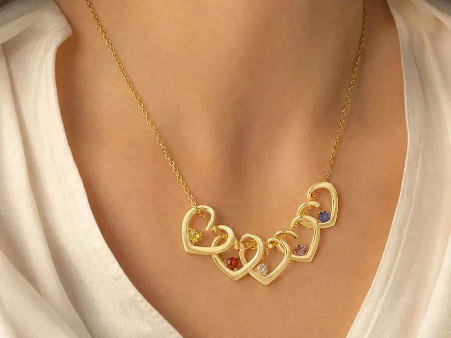
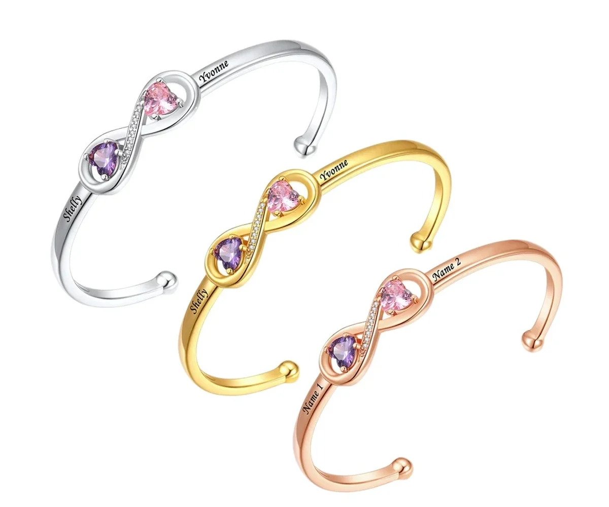
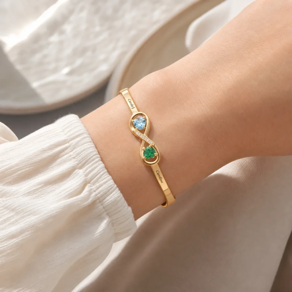
- Gold Tone generally gives the piece a warm yellow-metal appearance. It can coordinate easily with other warm-tone accessories, but the label alone does not identify precious-metal content.
- Rose Gold Tone gives the surface a warmer pink or copper-leaning appearance. The amount of warmth you perceive can change with room lighting, nearby colors, and the screen used to view a photograph.
- Stainless Steel Tone describes a cooler, neutral metal appearance. On a product with a separately stated base material, the tone label should not replace that material statement.
This is why option photographs are useful for comparison but not proof of composition. A photograph can show relative warmth and contrast; it cannot authenticate a material or guarantee an exact color match on every display. The Amorieva FAQ is a better companion when a label or product field needs clarification.
Use a three-question appearance test
First, look at what the recipient already wears most often. If their watch, earrings, or bag hardware are consistently warm, pink-toned, or cool neutral, that pattern may be more useful than a broad rule about complexion. Matching is optional, however. A contrasting tone can be intentional, so the recipient’s preference matters more than a universal styling formula.
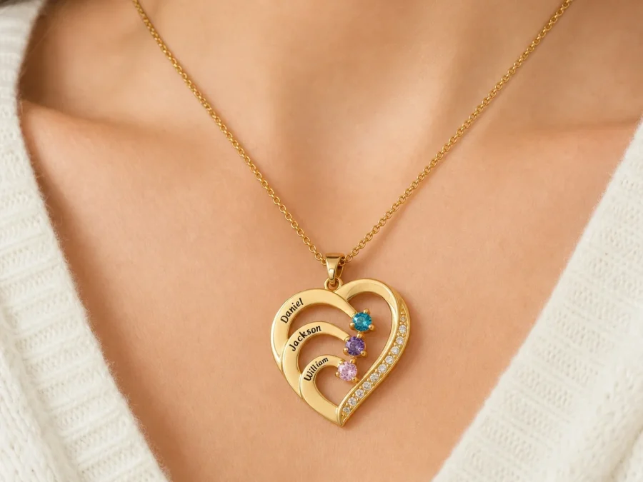
Second, consider what needs to remain visually distinct. Engraved names and colored accents sit within a larger metal-colored design. Compare the full product image rather than judging the tone from a small swatch alone. Third, decide whether coordination or variety is the goal. Someone building a consistent everyday set may want the familiar color family; someone choosing one symbolic piece may prefer a different tone that makes it easy to recognize.
If you are comparing several formats as well as color, browse the current personalized jewelry collection first. Tone availability and construction can differ by design, so do not carry an option from one product page onto another.
Apply the language to the Open Heart Birthstone Cuff
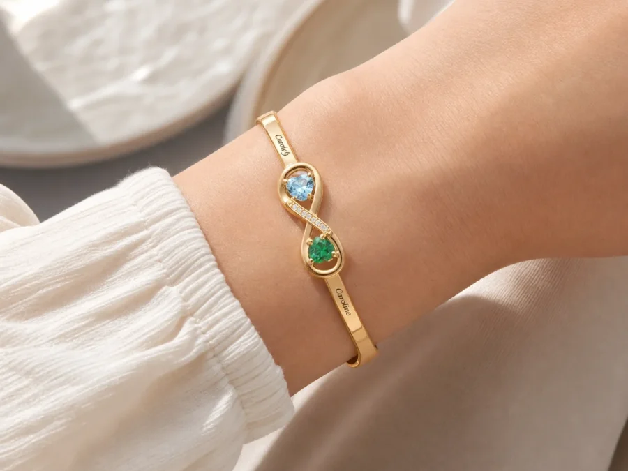
The Open Heart Birthstone Cuff makes the distinction concrete. Its current personalization is built for two loved ones: two engraved names and two selected birth months represented by simulated birthstone accents. The cuff is a plated copper-base design, and its visible tone choices are Gold Tone, Stainless Steel Tone, and Rose Gold Tone. In other words, the tone selector changes the chosen appearance; it does not rewrite the documented copper-base construction.
Choose this cuff conditionally. It can suit a recipient who wears an open, adjustable cuff and wants exactly two names paired with two month accents. It is not the right structure when more than two people must be represented. Before submitting the order, use the personalization process to check both name spellings, both birth months, and the selected tone as separate decisions.
Let construction—not color wording—guide care
A warm or cool color label does not make one option suitable for continuous water exposure or free from maintenance. Follow the care guidance for plated personalized jewelry: keep it dry, remove it before showering, swimming, exercise, saltwater, or chlorinated water, and avoid perfume and household chemicals. Wipe the surface gently with a soft lint-free cloth and store the piece separately. The full jewelry care guide applies across the three tone choices because the surface still deserves careful handling.
That also means a tone should not be chosen on an assumption that one color is automatically more durable than another. No such conclusion follows from the label. Select the appearance you prefer, then care for the documented construction.
Common questions
Does Gold Tone establish precious-metal content?
No. Gold Tone describes a gold-colored appearance. Confirm the product’s stated base material and finish separately, and do not infer a particular precious-metal construction or karat value from the tone name.
Does Stainless Steel Tone mean every part is stainless steel?
No. It identifies a cool metal-color option. For the Open Heart Birthstone Cuff, the current product facts describe a copper base with a plated surface, so the option label should not be treated as a different base-material claim.
Will the tone look exactly like it does on my screen?
Not necessarily. Photography, room light, display settings, and nearby colors can affect perception. Use the images to compare the options with one another, not as a guarantee of an exact screen-to-product color match.
The useful reading order is simple: choose the visible tone, verify the stated construction, and then confirm the personalization fields. Keeping those steps separate makes a color choice easier without turning an appearance label into a material promise.